Showing posts with label Charts. Show all posts
Showing posts with label Charts. Show all posts
Tuesday, November 15, 2011


Thursday, November 10, 2011
Winner of the Coolest Statistical Agency on web
The revamped ONS website is just great- congratulations.
Checkout their You-Tube Channel and the interactive charts
Thursday, September 29, 2011
Data Watch
Since the recession ended, businesses had increased their real spending on equipment and software by a strong 26%, while they have added almost nothing to their payrolls....

You can’t fault companies for investing in new machinery rather than hiring new workers. As two news reports detail, labor costs are rising, a function of both private and public pressures.
First, employers face a jump in health insurance costs. The Kaiser Family Foundation reported a 9% average increase in the premiums paid by employers this year. The average yearly cost to cover a family hit a record $15,073, up sharply from $13,770 in 2010.
Related:
Annual Capital Expenditures Survey
Saturday, August 27, 2011
Mongolia - the Economy in Pictures


Mongolia’s economic outlook depends heavily on global macroeconomic factors: the current uncertainty and poor growth prospects for the global economy are cause for concern. If there is another global recession, Mongolia’s small, open economy will be affected. In that case, China’s policy reaction will be crucial for Mongolia. If China reacts as fast and as strongly as it did in 2008/9 then the effects of a global recession on Mongolia will be mitigated, largely owing to Chinese demand for minerals from Mongolia. Beyond this, it is up to Mongolia to capitalize on its excellent long term prospects by continuing the reform agenda it embarked on during the 2008/9 crisis.
Saturday, March 26, 2011

Monday, February 7, 2011

Friday, May 21, 2010
Fiji Economy in Pictures
A recent review of the Fijian economy by IMF;


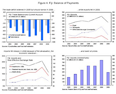


In Short: to boost growth do upfront fiscal adjustment including 'right sizing' the civil service.


In Short: to boost growth do upfront fiscal adjustment including 'right sizing' the civil service.
Saturday, April 17, 2010
Sunday Economic Indicator - I/S Ratio shows inventory replenishment
Coverage of an economic indicator every week- the idea borrowed from Sunday Function over at Built on Facts blog.

Definition: Inventories / Sales Ratios (Retail) - The inventories / sales ratios show the relationship of the end-of-month values of inventory to the monthly sales. These ratios can be looked at as indications of the number of months of inventory that are on hand in relation to the sales for a month. For example, a ratio of 2.5 would indicate that the retail stores have enough merchandise on hand to cover two and a half months of sales.
Latest Numbers: Inventories/Sales Ratio. The total business inventories/sales ratio based on seasonally adjusted data at the end of February was 1.27. The February 2009 ratio was 1.46.
Implications: 'this is the message of the inventory cycle, which appears to have largely run its course. Inventories surged as the recession intensified, leaving firms scrambling to bring output in line with the new level of sales. Now, firms have inventories under control'
More on the Implications:
Over at Macroblog more analysis;
From Bloomberg: The ratio of business inventories to sales was 1.25 in January, just above a 29-year low of 1.24 set in 2006 and down from a recession high of 1.46 in January 2009. The ratio averaged 1.3 in the last economic expansion, from 2001 to 2007.
Other tables released with the data;
Comments: Businesses generally prefer 1.45 months worth of goods. Though a lagging indicator, a window onto future orders and production activity. Remember GDP is calculated by adding all the sales in the economy plus change in inventories.
Related:
Manufacturing and Trade Inventory-to-Sales Ratio: Inventory Adjustment Over;
Inventories to Sales on Google Fast Flip
What We Don’t Know About the Economy

Definition: Inventories / Sales Ratios (Retail) - The inventories / sales ratios show the relationship of the end-of-month values of inventory to the monthly sales. These ratios can be looked at as indications of the number of months of inventory that are on hand in relation to the sales for a month. For example, a ratio of 2.5 would indicate that the retail stores have enough merchandise on hand to cover two and a half months of sales.
Latest Numbers: Inventories/Sales Ratio. The total business inventories/sales ratio based on seasonally adjusted data at the end of February was 1.27. The February 2009 ratio was 1.46.
Implications: 'this is the message of the inventory cycle, which appears to have largely run its course. Inventories surged as the recession intensified, leaving firms scrambling to bring output in line with the new level of sales. Now, firms have inventories under control'
More on the Implications:
Today's data is also encouraging because it shows that any business expansion we've seen in the first part of 2010 isn't outpacing consumer demand, with inventory levels remaining nearly flat. Considering how strong retail sales were in March, there's also reason to believe that inventories will fall during the month -- unless more hiring produced additional goods to compensate for the increased buying. Given the current balance of inventories and sales, there's little reason to believe U.S. businesses should engage in many more mass layoffs unless consumer demand unexpectedly weakens significantly.
Over at Macroblog more analysis;
I have been pondering those data as well, ever since the advance fourth quarter gross domestic product report indicated that 3.4 percentage points of the then-reported 5.9 percent annualized growth rate was accounted for by a slowing in the pace of inventory decumulation. (The numbers have subsequently been revised to 3.8 percentage points of a 5.6 percent growth rate.) It certainly appears that inventory-sales ratios have reverted to the prerecession norm, justifying Duy's sense that inventories will not be a big part of the economic story as we move through 2010.
That conclusion does rest, of course, on the likelihood that a downward trend in the ratio truly did break in the middle part of the decade. As the chart shows, the same pause in the trend occurred in the mid-1990s, only to commence its southward trek on the other side of the 2001 recession.
But the situation is even more curious than that. If you dig a little deeper, you find that not all inventory-sales ratios tell the same story. In particular, inventory-to-sales ratios at the retail level look very lean relative to prerecession levels while manufacturer's inventories still appear to be relatively bloated.
What, exactly, is that chart trying to tell us? Does it represent some shift in supply-chain management, with inventory holdings being pushed down from the retail level to manufacturers? If not, can we expect some resurgence in retail inventories (as the Duy-cited Bloomberg article suggests), coupled with continued decumulation at the manufacturing level? And what would be the net effect of such developments on aggregate inventory levels?
From Bloomberg: The ratio of business inventories to sales was 1.25 in January, just above a 29-year low of 1.24 set in 2006 and down from a recession high of 1.46 in January 2009. The ratio averaged 1.3 in the last economic expansion, from 2001 to 2007.
Other tables released with the data;
Table 1. Estimated Monthly Sales and Inventories for Manufacturers, Retailers, and Merchant Wholesalers
Table 2. Percent Changes for Sales and Inventories--Manufacturers, Retailers, and Merchant Wholesalers
Table 3. Estimated Monthly Retail Sales, Inventories, and Inventories/Sales Ratios, By Kind of Business
Comments: Businesses generally prefer 1.45 months worth of goods. Though a lagging indicator, a window onto future orders and production activity. Remember GDP is calculated by adding all the sales in the economy plus change in inventories.
Related:
Manufacturing and Trade Inventory-to-Sales Ratio: Inventory Adjustment Over;
inventory to sales ratio. This has declined sharply to 1.25 (SA) from the peak of 1.46 back in Dec 2008. This could decline further - the trend is definitely down over time - but clearly most of the inventory adjustment is over.
This is important because the change in inventory added significantly to Q4 GDP growth. (See BEA line 13: the contribution to GDP in Q4 from 'Change in private inventories' was 3.88 of the 5.9 percent annualized increase in GDP.)
Inventories to Sales on Google Fast Flip
What We Don’t Know About the Economy
Subscribe to:
Posts (Atom)


.png)